Founderway ~ Design System
Founderway ~ Design System
Founderway ~ Design System
Founderway ~ Design System
A scalable, accessible system to unify design and streamline collaboration.
A scalable, accessible system to unify design and streamline collaboration.
A scalable, accessible system to unify design and streamline collaboration.
A scalable, accessible system to unify design and streamline collaboration.
My Role
My Role
My Role
My Role
Product Designer Intern
Product Designer Intern
Product Designer Intern
Product Designer Intern
Team
Team
Team
Frontend developers, AI Engineers
Frontend developers, AI Engineers
Frontend developers, AI Engineers
Tools • Techniques
Tools • Techniques
Tools • Techniques
Tools • Techniques
Figma, Mural • Interface Inventory, Component Style Guide, Dev Handoff, Accessibility
Figma, Mural • UI Inventory, Component Style Guide, Dev Handoff, Accessibility
Figma, Mural • UI Inventory, Component Style Guide, Dev Handoff, Accessibility
Figma, Mural • UI Inventory, Component Style Guide, Dev Handoff, Accessibility
Figma, Mural • Component Style Guide, Dev Handoff, Accessibility
BACKGROUND
BACKGROUND
BACKGROUND
Designing with Purpose, Scaling with Ease
Designing with Purpose, Scaling with Ease
Designing with Purpose, Scaling with Ease
Designing with Purpose, Scaling with Ease
As part of my 5-month internship at Founderway, I worked cross-functionally with product managers, designers, and engineers to redevelop a modular design system. My focus was on reducing design inconsistencies and improving development efficiency—helping the team scale faster without compromising on quality.
As part of my 5-month internship at Founderway, I worked cross-functionally with product managers, designers, and engineers to redevelop a modular design system. My focus was on reducing design inconsistencies and improving development efficiency—helping the team scale faster without compromising on quality.
As part of my 5-month internship at Founderway, I worked cross-functionally with product managers, designers, and engineers to redevelop a modular design system. My focus was on reducing design inconsistencies and improving development efficiency—helping the team scale faster without compromising on quality.
As part of my 5-month internship at Founderway, I worked cross-functionally with product managers, designers, and engineers to redevelop a modular design system. My focus was on reducing design inconsistencies and improving development efficiency—helping the team scale faster without compromising on quality.
THE PROBLEM
THE PROBLEM
THE PROBLEM
The existing design system was fragmented and difficult to use:
The existing design system was fragmented and difficult to use:
The existing design system was fragmented and difficult to use:
The existing design system was fragmented and difficult to use:
No central documentation
Disorganized and outdated component library
Frequent duplication of components
Developers struggled to locate the right assets or follow consistent styles
No central documentation
Disorganized and outdated component library
Frequent duplication of components
Developers struggled to locate the right assets or follow consistent styles
No central documentation
Disorganized and outdated component library
Frequent duplication of components
Developers struggled to locate the right assets or follow consistent styles
No central documentation
Disorganized and outdated component library
Frequent duplication of components
Developers struggled to locate the right assets or follow consistent styles

THE BIG QUESTION IS
THE BIG QUESTION IS
THE BIG QUESTION IS
How might we turn a fragmented design foundation into a cohesive system that’s accessible, inclusive, and learnable for everyone involved in the product development lifecycle?
How might we turn a fragmented design foundation into a cohesive system that’s accessible, inclusive, and learnable for everyone involved in the product development lifecycle?
How might we turn a fragmented design foundation into a cohesive system that’s accessible, inclusive, and learnable for everyone involved in the product development lifecycle?
How might we turn a fragmented design foundation into a cohesive system that’s accessible, inclusive, and learnable for everyone involved in the product development lifecycle?
GOALS
GOALS
GOALS
Build a robust, reusable component library
Improve discoverability and structure of the design system
Support seamless cross-functional collaboration
Build a robust, reusable component library
Improve discoverability and structure of the design system
Support seamless cross-functional collaboration
Build a robust, reusable component library
Improve discoverability and structure of the design system
Support seamless cross-functional collaboration
Build a robust, reusable component library
Improve discoverability and structure of the design system
Support seamless cross-functional collaboration

RESEARCH PROCESS
RESEARCH PROCESS
RESEARCH PROCESS
Competitive Audit
Competitive Audit
Competitive Audit
Competitive Audit
I studied well-known design systems like Apple’s Human Interface Guidelines, Atlassian, Carbon, and Material Design to identify common best practices.
I studied well-known design systems like Apple’s Human Interface Guidelines, Atlassian, Carbon, and Material Design to identify common best practices.
I studied well-known design systems like Apple’s Human Interface Guidelines, Atlassian, Carbon, and Material Design to identify common best practices.
I studied well-known design systems like Apple’s Human Interface Guidelines, Atlassian, Carbon, and Material Design to identify common best practices.
Audit focused on four key areas:
Audit focused on four key areas:
Audit focused on four key areas:
Audit focused on four key areas:
Figma Component Architecture – how components are built, nested, and named for scalability
Documentation – how usage guidelines are written and organized for easy understanding
Style Guide Structure – how visual foundations like color, typography, and spacing are standardized
Code Integration – how design tokens and components are mapped to actual implementatio
Stakeholder Insights
Stakeholder Insights
Stakeholder Insights
Stakeholder Insights
To understand real challenges with the existing system, I interviewed team members across design, engineering, and product. These conversations helped surface key pain points that guided our redesign strategy.
To understand real challenges with the existing system, I interviewed team members across design, engineering, and product. These conversations helped surface key pain points that guided our redesign strategy.
To understand real challenges with the existing system, I interviewed team members across design, engineering, and product. These conversations helped surface key pain points that guided our redesign strategy.
To understand real challenges with the existing system, I interviewed team members across design, engineering, and product. These conversations helped surface key pain points that guided our redesign strategy.

User Interface Inventory
User Interface Inventory
User Interface Inventory
User Interface Inventory
I captured all the live components present across the platform and organized them in Mural to conduct a comprehensive interface audit, helping us identify reusable patterns and gaps in UI coverage.
I captured all the live components present across the platform and organized them in Mural to conduct a comprehensive interface audit, helping us identify reusable patterns and gaps in UI coverage.
I captured all the live components present across the platform and organized them in Mural to conduct a comprehensive interface audit, helping us identify reusable patterns and gaps in UI coverage.
I captured all the live components present across the platform and organized them in Mural to conduct a comprehensive interface audit, helping us identify reusable patterns and gaps in UI coverage.

FOUNDATION
FOUNDATION
FOUNDATION
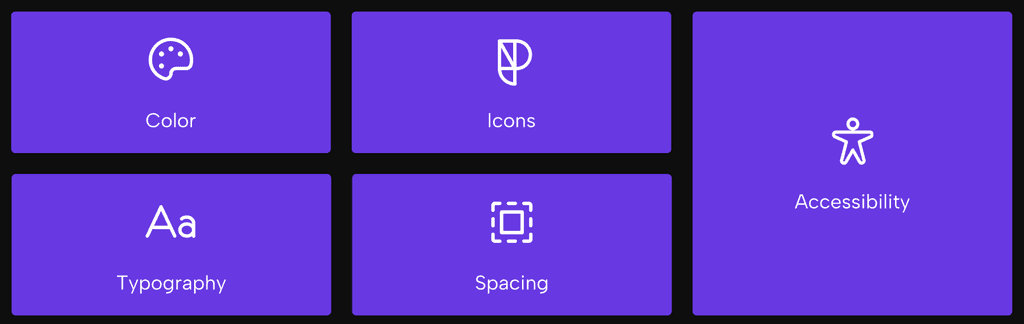
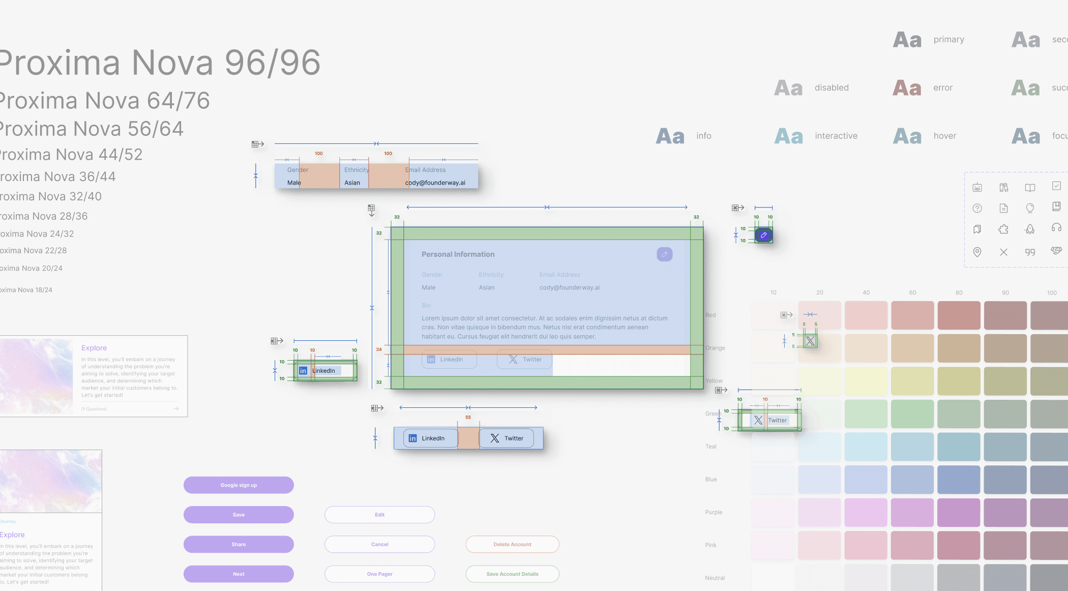
COLOR
COLOR
COLOR
Unified color tokens, with purple (#722ceb) as our primary tone to convey wisdom and creativity.
Unified color tokens, with purple (#722ceb) as our primary tone to convey wisdom and creativity.
Unified color tokens, with purple (#722ceb) as our primary tone to convey wisdom and creativity.
Unified color tokens, with purple (#722ceb) as our primary tone to convey wisdom and creativity.


TYPOGRAPHY
TYPOGRAPHY
TYPOGRAPHY
To ensure clarity and visual hierarchy across the platform, we selected two complementary typefaces:
To ensure clarity and visual hierarchy across the platform, we selected two complementary typefaces:
To ensure clarity and visual hierarchy across the platform, we selected two complementary typefaces:
To ensure clarity and visual hierarchy across the platform, we selected two complementary typefaces:
Proxima Nova – used for headings to create a bold, modern, and structured visual tone.
Proxima Nova – used for headings to create a bold, modern, and structured visual tone.
Proxima Nova – used for headings to create a bold, modern, and structured visual tone.
Proxima Nova – used for headings to create a bold, modern, and structured visual tone.

Inter – used for subheadings and body text due to its high readability and neutral style, especially across digital interfaces.
Inter – used for subheadings and body text due to its high readability and neutral style, especially across digital interfaces.
Inter – used for subheadings and body text due to its high readability and neutral style, especially across digital interfaces.
Inter – used for subheadings and body text due to its high readability and neutral style, especially across digital interfaces.

This combination strikes a balance between personality and functionality, supporting a clean, accessible reading experience across devices.
This combination strikes a balance between personality and functionality, supporting a clean, accessible reading experience across devices.
This combination strikes a balance between personality and functionality, supporting a clean, accessible reading experience across devices.
This combination strikes a balance between personality and functionality, supporting a clean, accessible reading experience across devices.

ICONOGRAPHY
ICONOGRAPHY
ICONOGRAPHY
Icon variants enable consistent usage across states, improving flexibility for both design and development.
Icon variants enable consistent usage across states, improving flexibility for both design and development.
Icon variants enable consistent usage across states, improving flexibility for both design and development.
Icon variants enable consistent usage across states, improving flexibility for both design and development.

SPACING
SPACING
SPACING
Defined consistent spacing tokens and layout principles
Defined consistent spacing tokens and layout principles
Defined consistent spacing tokens and layout principles
Defined consistent spacing tokens and layout principles

BUTTON
BUTTON
BUTTON


PATTERNS
PATTERNS
PATTERNS

ACCESSIBILITY
ACCESSIBILITY
ACCESSIBILITY
Made sure this design system rocked accessibility from the get-go. I used this super cool Stark plugin to sniff out any problem.
Made sure this design system rocked accessibility from the get-go. I used this super cool Stark plugin to sniff out any problem.
Made sure this design system rocked accessibility from the get-go. I used this super cool Stark plugin to sniff out any problem.
Made sure this design system rocked accessibility from the get-go. I used this super cool Stark plugin to sniff out any problem.

DESIGN HANDOFF DOCUMENT
DESIGN HANDOFF DOCUMENT
DESIGN HANDOFF DOCUMENT
Created a standardized design handoff doc for developers with annotations, redlines, and accessibility notes—ensuring long-term usability.
Created a standardized design handoff doc for developers with annotations, redlines, and accessibility notes—ensuring long-term usability.
Created a standardized design handoff doc for developers with annotations, redlines, and accessibility notes—ensuring long-term usability.
Created a standardized design handoff doc for developers with annotations, redlines, and accessibility notes—ensuring long-term usability.

OUTCOME
OUTCOME
OUTCOME

LEARNINGS
LEARNINGS
LEARNINGS
Observe, Communicate, and Team Collaboration
Observe, Communicate, and Team Collaboration
Observe, Communicate, and Team Collaboration
Observe, Communicate, and Team Collaboration
Developing design system taught me the vital role of communication with engineering and developer team. Understanding their needs and constraints was key for seamless integration!
Developing design system taught me the vital role of communication with engineering and developer team. Understanding their needs and constraints was key for seamless integration!
Developing design system taught me the vital role of communication with engineering and developer team. Understanding their needs and constraints was key for seamless integration!
Developing design system taught me the vital role of communication with engineering and developer team. Understanding their needs and constraints was key for seamless integration!
Let's Work Together?
Now that you've come this far, let's work together on your next product?
Let's Work Together?
Now that you've come this far, let's work together on your next product?
Let's Work Together?
Now that you've come this far, let's work together on your next product?
Let's Work Together?
Now that you've come this far, let's work together on your next product?
Let's Work Together?
Now that you've come this far, let's work together on your next product?