Profile Management Feature
Profile Management Feature
Profile Management Feature
Profile Management Feature
Redesigning B2C Profile Hub to Empower Teams and Drive Engagement
Redesigning B2C Profile Hub to Empower Teams and Drive Engagement
Redesigning B2C Profile Hub to Empower Teams and Drive Engagement
Redesigning B2C Profile Hub to Empower Teams and Drive Engagement
My Role
My Role
My Role
My Role
Product Designer Intern
Product Designer Intern
Product Designer Intern
Product Designer Intern
Team
Team
Team
Frontend Developer, AI Engineer
Frontend Developer, AI Engineer
Frontend Developer, AI Engineer
Tools • Techniques
Tools • Techniques
Tools • Techniques
Tools • Techniques
Figma, Mural • UX Research • Interaction Design, Visual Design • Design Thinking
Figma, Mural • UX Research, Visual Design, Design Thinking
Figma, Mural • UX Research • Interaction Design, Visual Design • Design Thinking
Figma, Mural • UX Research, Visual Design, Design Thinking

BACKGROUND
BACKGROUND
BACKGROUND
The profile redesign was kicked off under a tight 3-week timeline to launch during Techstars Boston Week. The goal was to revamp the existing profile experience and introduce new features that would boost engagement, usability, and retention.
The profile redesign was kicked off under a tight 3-week timeline to launch during Techstars Boston Week. The goal was to revamp the existing profile experience and introduce new features that would boost engagement, usability, and retention.
The profile redesign was kicked off under a tight 3-week timeline to launch during Techstars Boston Week. The goal was to revamp the existing profile experience and introduce new features that would boost engagement, usability, and retention.
The profile redesign was kicked off under a tight 3-week timeline to launch during Techstars Boston Week. The goal was to revamp the existing profile experience and introduce new features that would boost engagement, usability, and retention.
THE PROBLEM
THE PROBLEM
THE PROBLEM
The original profile page bundled both user and company information into one view, resulting in:
The original profile page bundled both user and company information into one view, resulting in:
The original profile page bundled both user and company information into one view, resulting in:
The original profile page bundled both user and company information into one view, resulting in:
Poor scannability and high cognitive load
Reduced engagement and page views
Lack of actionable insights for startup founders
Poor scannability and high cognitive load
Reduced engagement and page views
Lack of actionable insights for startup founders
Poor scannability and high cognitive load
Reduced engagement and page views
Lack of actionable insights for startup founders
Poor scannability and high cognitive load
Reduced engagement and page views
Lack of actionable insights for startup founders
NOW THE QUESTION IS?
NOW THE QUESTION IS?
NOW THE QUESTION IS?
How might we improve visibility and discoverability for user and company profiles, while introducing new features that reduce drop-off and increase user retention?
How might we improve visibility and discoverability for user and company profiles, while introducing new features that reduce drop-off and increase user retention?
How might we improve visibility and discoverability for user and company profiles, while introducing new features that reduce drop-off and increase user retention?
How might we improve visibility and discoverability for user and company profiles, while introducing new features that reduce drop-off and increase user retention?
USER RESEARCH + DISCOVERY
USER RESEARCH + DISCOVERY
USER RESEARCH + DISCOVERY
Heatmap Analysis
Heatmap Analysis
Heatmap Analysis
Heatmap Analysis
Hotjar heatmaps showed users rarely clicked or scrolled beyond the top 20% of the page.
Most ignored key company data areas, indicating poor layout and unclear purpose.
Hotjar heatmaps showed users rarely clicked or scrolled beyond the top 20% of the page.
Most ignored key company data areas, indicating poor layout and unclear purpose.
Hotjar heatmaps showed users rarely clicked or scrolled beyond the top 20% of the page.
Most ignored key company data areas, indicating poor layout and unclear purpose.
Hotjar heatmaps showed users rarely clicked or scrolled beyond the top 20% of the page.
Most ignored key company data areas, indicating poor layout and unclear purpose.
User Interviews
User Interviews
User Interviews
User Interviews
Interviewed 12 startup founders and team members to understand their pain points. Key insights showed:
Interviewed 12 startup founders and team members to understand their pain points. Key insights showed:
Interviewed 12 startup founders and team members to understand their pain points. Key insights showed:
Interviewed 12 startup founders and team members to understand their pain points. Key insights showed:
80% didn’t understand the purpose of the page
80% didn’t understand the purpose of the page
80% didn’t understand the purpose of the page
Most spent less than 2 minutes on it
Most spent less than 2 minutes on it
Most spent less than 2 minutes on it
Users wanted distinction between profiles
users wanted distinction between profiles
users Wanted distinction between profiles
Users wanted distinction between profiles
Competitive Analysis
Competitive Analysis
Competitive Analysis
Competitive Analysis
Studied 25+ platforms to evaluate profile and dashboard patterns. Identified gaps such as real-time visual analytics, user-personalized dashboards, and integrated team management tools.
Studied 25+ platforms to evaluate profile and dashboard patterns. Identified gaps such as real-time visual analytics, user-personalized dashboards, and integrated team management tools.
Studied 25+ platforms to evaluate profile and dashboard patterns. Identified gaps such as real-time visual analytics, user-personalized dashboards, and integrated team management tools.
Studied 25+ platforms to evaluate profile and dashboard patterns. Identified gaps such as real-time visual analytics, user-personalized dashboards, and integrated team management tools.

BRAINSTORMING
BRAINSTORMING
BRAINSTORMING
In cross-functional workshops, we aligned on MVP features that will be included in the redesign.
In cross-functional workshops, we aligned on MVP features that will be included in the redesign.
In cross-functional workshops, we aligned on MVP features that will be included in the redesign.
In cross-functional workshops, we aligned on MVP features that will be included in the redesign.
In cross-functional workshops, we aligned on MVP features that will be included in the redesign.

INFORMATION ARCHITECTURE
INFORMATION ARCHITECTURE
INFORMATION ARCHITECTURE
Restructured the information architecture to separate company and user and company profile, surface high-priority data first, and reduce data search time by an estimated 25%
Restructured the information architecture to separate company and user and company profile, surface high-priority data first, and reduce data search time by an estimated 25%
Restructured the information architecture to separate company and user and company profile, surface high-priority data first, and reduce data search time by an estimated 25%
Restructured the information architecture to separate company and user and company profile, surface high-priority data first, and reduce data search time by an estimated 25%
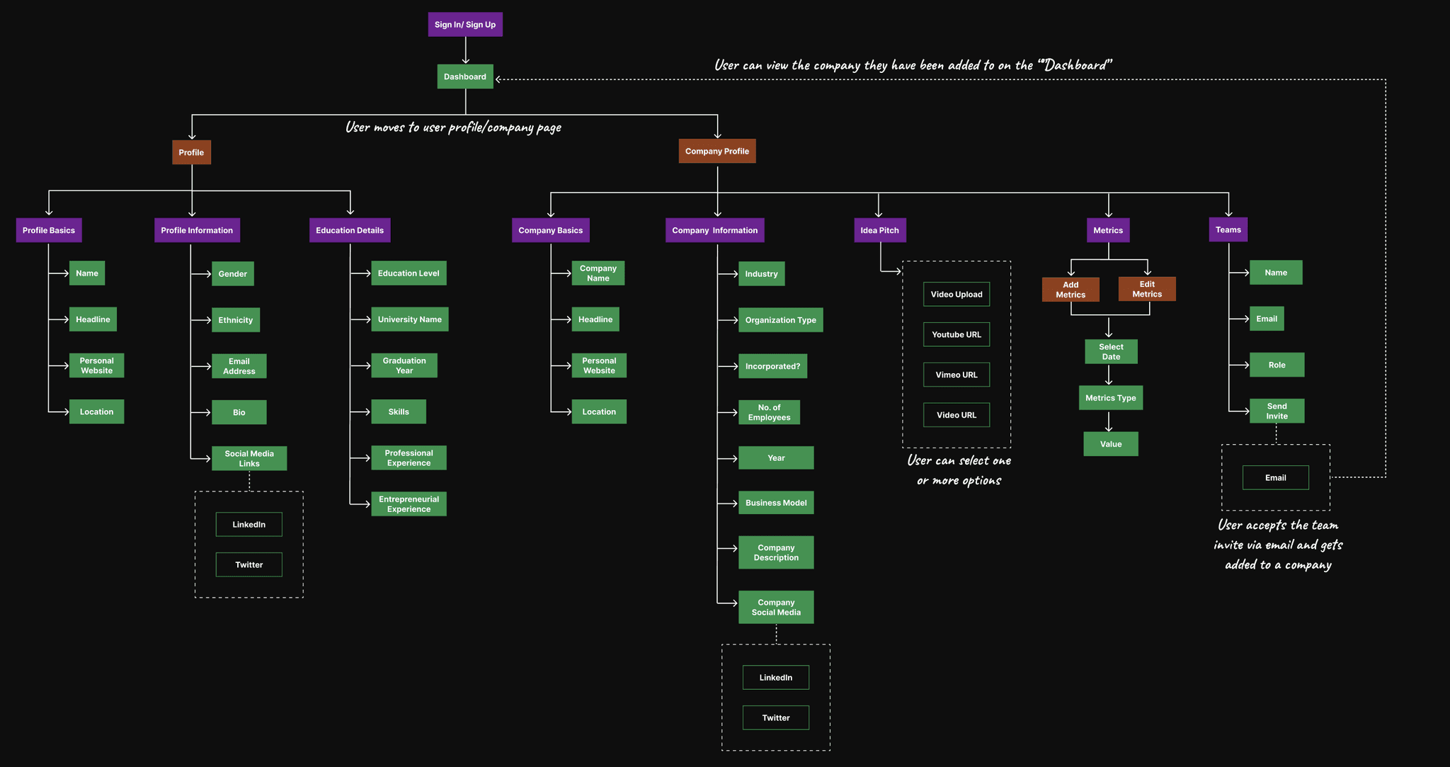
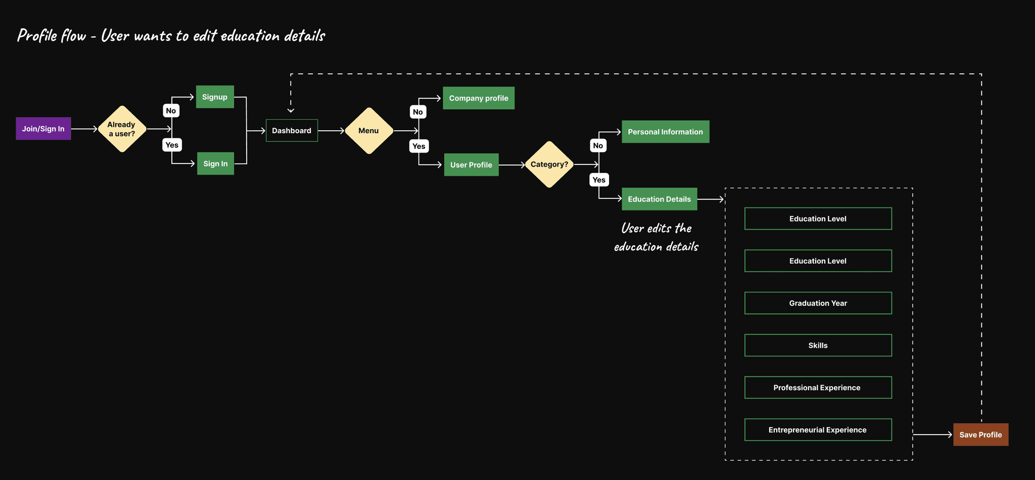
User Flow
User Flow
User Flow
User Flow
WIREFRAMES
WIREFRAMES
WIREFRAMES
I explored multiple low-fidelity wireframes to test layout and content hierarchy. After team feedback on version 2, I aligned on a split-profile structure and clearer task flows, which shaped the foundation for the final designs.
I explored multiple low-fidelity wireframes to test layout and content hierarchy. After team feedback on version 2, I aligned on a split-profile structure and clearer task flows, which shaped the foundation for the final designs.
I explored multiple low-fidelity wireframes to test layout and content hierarchy. After team feedback on version 2, I aligned on a split-profile structure and clearer task flows, which shaped the foundation for the final designs.
I explored multiple low-fidelity wireframes to test layout and content hierarchy. After team feedback on version 2, I aligned on a split-profile structure and clearer task flows, which shaped the foundation for the final designs.

DESIGN DECISIONS ~ TESTING VISUALS & INTERACTION
DESIGN DECISIONS ~ TESTING VISUALS
DESIGN DECISIONS ~ TESTING VISUALS & INTERACTION
After validating the structural layout through wireframes, I created two high-fidelity concepts to test variations in visual hierarchy, usability, and engagement. Each design built on the same layout logic but explored different UI styles and interaction patterns.
After validating the structural layout through wireframes, I created two high-fidelity concepts to test variations in visual hierarchy, usability, and engagement. Each design built on the same layout logic but explored different UI styles and interaction patterns.
After validating the structural layout through wireframes, I created two high-fidelity concepts to test variations in visual hierarchy, usability, and engagement. Each design built on the same layout logic but explored different UI styles and interaction patterns.
After validating the structural layout through wireframes, I created two high-fidelity concepts to test variations in visual hierarchy, usability, and engagement. Each design built on the same layout logic but explored different UI styles and interaction patterns.
This helped us identify which design best resonated with our target users and fit Founderway’s product personality
This helped us identify which design best resonated with our target users and fit Founderway’s product personality
This helped us identify which design best resonated with our target users and fit Founderway’s product personality
This helped us identify which design best resonated with our target users and fit Founderway’s product personality


Card-based layout with clean, traditional presentation - but lacked emphasis on personalization
Neutral visual hierarchy, compact and dense
Card-based layout with clean, traditional presentation
Neutral visual hierarchy, compact and dense
Card-based layout with clean, traditional presentation
Neutral visual hierarchy, compact and dense
Card-based layout with clean, traditional presentation
Neutral visual hierarchy, compact and dense
Sidebar-based navigation with scroll + active state feedback
Clear section breakdown, visually reinforced
Sidebar-based navigation with scroll + active state feedback
Clear section breakdown, visually reinforced
Sidebar-based navigation with scroll + active state feedback
Clear section breakdown, visually reinforced
Sidebar-based navigation with scroll + active state feedback
Clear section breakdown, visually reinforced
Result: Users found it functional but less engaging; couldn’t distinguish between view vs. edit mode at first glance
Result: Users found it functional but less engaging; couldn’t distinguish between view vs. edit mode at first glance
Result: Users found it functional but less engaging; couldn’t distinguish between view vs. edit mode at first glance
Result: Users found it functional but less engaging; couldn’t distinguish between view vs. edit mode at first glance
Result: Users responded positively to the visual clarity and profile focus; 80% found it easier to navigate and edit
Result: Users responded positively to the visual clarity and profile focus; 80% found it easier to navigate and edit
Result: Users responded positively to the visual clarity and profile focus; 80% found it easier to navigate and edit
Result: Users responded positively to the visual clarity and profile focus; 80% found it easier to navigate and edit
Why Design B Was Choosen?
Why Design B Was Choosen?
Why Design B Was Choosen?
Why Design B Was Choosen?
9/10
35%
35%
35%
35%
users aligned with the mental model and preferred scroll-linked navigation
users aligned with the mental model and preferred scroll-linked navigation
users aligned with the mental model and preferred scroll-linked navigation
users aligned with the mental model and preferred scroll-linked navigation
users aligned with the mental model and preferred scroll-linked navigation
80%
35%
35%
35%
35%
users found it easier to discover key content because of the redesigned layout
users found it easier to discover key content because of the redesigned layout
users found it easier to discover key content because of the redesigned layout
users found it easier to discover key content because of the redesigned layout
users found it easier to discover key content because of the redesigned layout
85%
35%
35%
35%
35%
users found the new metrics and collaboration tools made their workflow easier
users found the new metrics and collaboration tools made their workflow easier
users found the new metrics and collaboration tools made their workflow easier
users found the new metrics and collaboration tools made their workflow easier
users found the new metrics and collaboration tools made their workflow easier
Insight: Design B outperformed A in usability, clarity, and emotional connection—making it the clear winner for implementation.
Insight: Design B outperformed A in usability, clarity, and emotional connection—making it the clear winner for implementation.
Insight: Design B outperformed A in usability, clarity, and emotional connection—making it the clear winner for implementation.
Insight: Design B outperformed A in usability, clarity, and emotional connection—making it the clear winner for implementation.
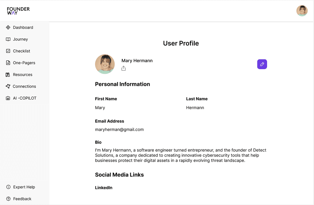
FINAL DESIGNS ~ HIGH-FIDELITY PROTOTYPES
FINAL DESIGNS ~ HIGH-FIDELITY PROTOTYPES
FINAL DESIGNS ~ HIGH-FIDELITY PROTOTYPES
Before Redesign
Before Redesign
Before Redesign
Before Redesign
After Redesign
After Redesign
After Redesign
After Redesign
"CHALLENGES" THAT SHAPED THE DESIGNS
"CHALLENGES" THAT SHAPED THE DESIGNS
"CHALLENGES" THAT SHAPED THE DESIGNS
Challenge #1: How can I help users avoid manual scrolling and stay oriented while navigating vertically stacked profile sections?
Challenge #1: How can I help users avoid manual scrolling and stay oriented while navigating vertically stacked profile sections?
Challenge #1: How can I help users avoid manual scrolling and stay oriented while navigating vertically stacked profile sections?
Challenge #1: How can I help users avoid manual scrolling and stay oriented while navigating vertically stacked profile sections?
Challenge #1: How can I help users avoid manual scrolling and stay oriented while navigating vertically stacked profile sections?
Solution: I designed a scroll-linked sidebar (scrollspy) that:
Highlights the current section as the user scrolls
Allows quick jumps to any section with a single click
Solution: I designed a scroll-linked sidebar (scrollspy) that:
Highlights the current section as the user scrolls
Allows quick jumps to any section with a single click
Solution: I designed a scroll-linked sidebar (scrollspy) that:
Highlights the current section as the user scrolls
Allows quick jumps to any section with a single click
Solution: I designed a scroll-linked sidebar (scrollspy) that:
Highlights the current section as the user scrolls
Allows quick jumps to any section with a single click
Challenge #2: Where should I start to ensure the platform delivers a unified experience across desktop and mobile?
Challenge #2: Where should I start to ensure the platform delivers a unified experience across desktop and mobile?
Challenge #2: Where should I start to ensure the platform delivers a unified experience across desktop and mobile?
Challenge #2: Where should I start to ensure the platform delivers a unified experience across desktop and mobile?
Challenge #2: Where should I start to ensure the platform delivers a unified experience across desktop and mobile?
I adopted a mobile-first design approach, starting with small screen constraints to prioritize essential content and interactions. Once optimized for mobile, I scaled up to desktop layouts using adaptive grid structures—ensuring consistency, responsiveness, and performance across devices.
I adopted a mobile-first design approach, starting with small screen constraints to prioritize essential content and interactions. Once optimized for mobile, I scaled up to desktop layouts using adaptive grid structures—ensuring consistency, responsiveness, and performance across devices.
I adopted a mobile-first design approach, starting with small screen constraints to prioritize essential content and interactions. Once optimized for mobile, I scaled up to desktop layouts using adaptive grid structures—ensuring consistency, responsiveness, and performance across devices.
I adopted a mobile-first design approach, starting with small screen constraints to prioritize essential content and interactions. Once optimized for mobile, I scaled up to desktop layouts using adaptive grid structures—ensuring consistency, responsiveness, and performance across devices.

KEY FEATURES INTRODUCED
KEY FEATURES INTRODUCED
KEY FEATURES INTRODUCED
Metrics Management Tool
Metrics Management Tool
Metrics Management Tool
Metrics Management Tool
Designed a metrics dashboard to give founders real-time visibility into startup KPIs.
Designed a metrics dashboard to give founders real-time visibility into startup KPIs.
Designed a metrics dashboard to give founders real-time visibility into startup KPIs.
Designed a metrics dashboard to give founders real-time visibility into startup KPIs.
In early usability testing, users showed strong interest—spending 15% more time reviewing prototype data compared to standard profile views.
In early usability testing, users showed strong interest—spending 15% more time reviewing prototype data compared to standard profile views.
In early usability testing, users showed strong interest—spending 15% more time reviewing prototype data compared to standard profile views.
In early usability testing, users showed strong interest—spending 15% more time reviewing prototype data compared to standard profile views.

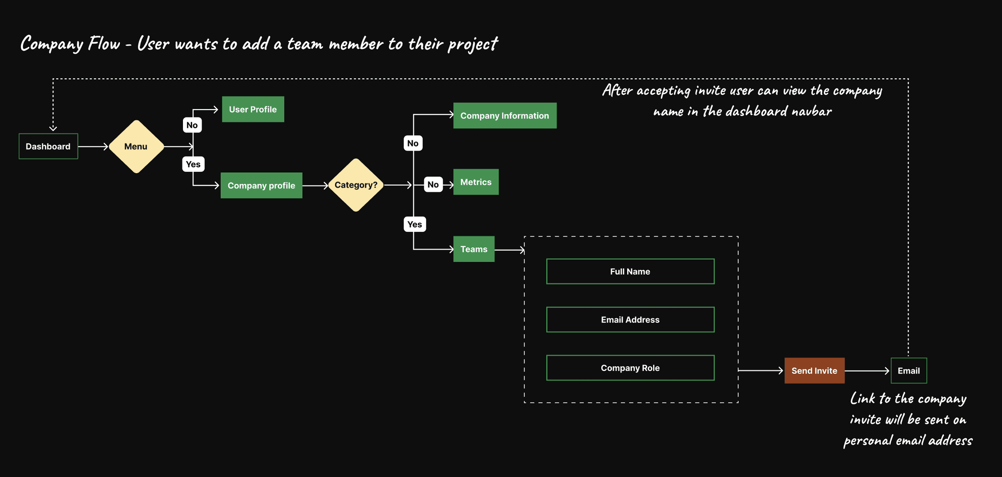
Teams Collaboration Tool
Teams Collaboration Tool
Teams Collaboration Tool
Teams Collaboration Tool
Designed a collaboration space within the company profile to help teams manage projects, save documentation, and share updates.
Designed a collaboration space within the company profile to help teams manage projects, save documentation, and share updates.
Designed a collaboration space within the company profile to help teams manage projects, save documentation, and share updates.
Designed a collaboration space within the company profile to help teams manage projects, save documentation, and share updates.
Initial user testing indicated 8/10 participants found the concept valuable for streamlining communication and flagged it as essential for remote team coordination.
Initial user testing indicated 8/10 participants found the concept valuable for streamlining communication and flagged it as essential for remote team coordination.
Initial user testing indicated 8/10 participants found the concept valuable for streamlining communication and flagged it as essential for remote team coordination.
Initial user testing indicated 8/10 participants found the concept valuable for streamlining communication and flagged it as essential for remote team coordination.
CONCLUSION
CONCLUSION
CONCLUSION
The redesign simplified navigation, boosted engagement, and introduced core functionality for founders and teams—resulting in 250+ new user onboardings post-launch.
The redesign simplified navigation, boosted engagement, and introduced core functionality for founders and teams—resulting in 250+ new user onboardings post-launch.
The redesign simplified navigation, boosted engagement, and introduced core functionality for founders and teams—resulting in 250+ new user onboardings post-launch.
The redesign simplified navigation, boosted engagement, and introduced core functionality for founders and teams—resulting in 250+ new user onboardings post-launch.
Let's Work Together?
Now that you've come this far, let's work together on your next product?
Let's Work Together?
Now that you've come this far, let's work together on your next product?
Let's Work Together?
Now that you've come this far, let's work together on your next product?
Let's Work Together?
Now that you've come this far, let's work together on your next product?
Let's Work Together?
Now that you've come this far, let's work together on your next product?